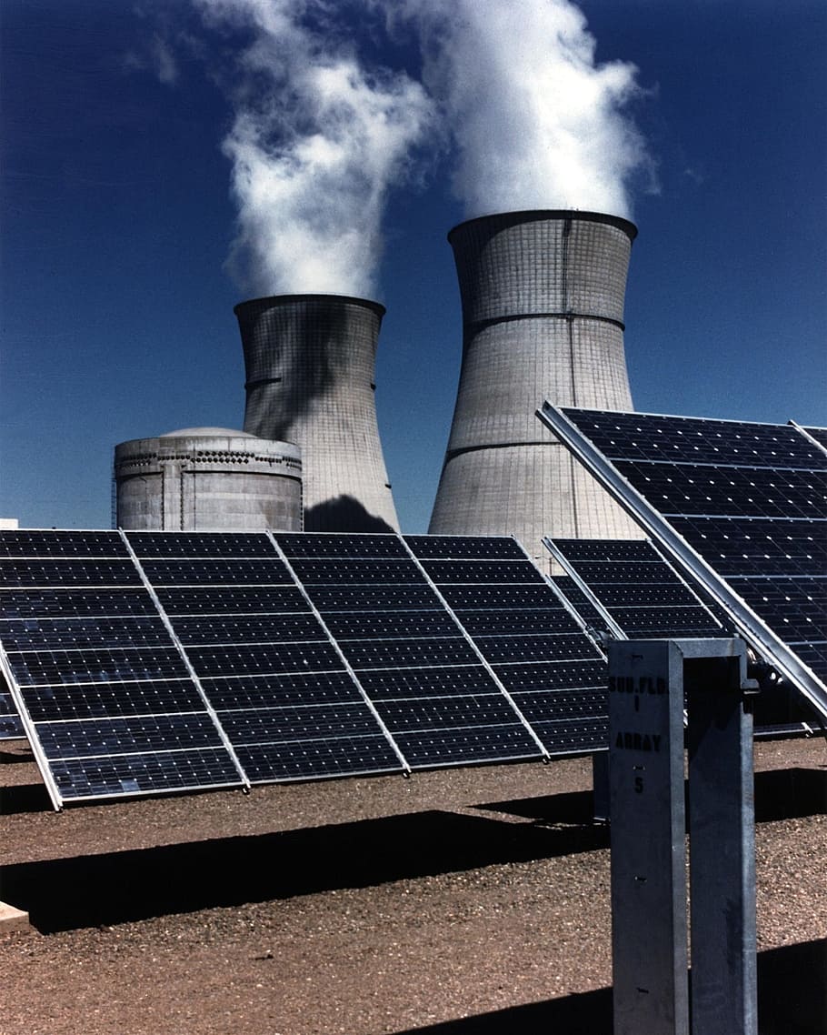
Below you can find a slide deck with many visualisations – maps, charts, and tables – which look at the sources and carbon intensity of electricity generation across states in the US.
Click through the slides using the arrows. The charts are interactive.
This underlying data comes from Ember Climate. If you use this data, please make sure to credit them.
I have built it for free, and provide it as a public good. You are welcome to reuse it (or parts of it) if it’s helpful for you.
